How to Choose the Right Kitchen Tile Color Combination
.jpg&w=3840&q=75&dpl=dpl_8sPzAbVjqEfoSELw3wwseHectCLv)
Color is one of the finest ways to give a room individuality, and your kitchen tile color should reflect your taste. Nearly every surface in your kitchen may be colored, but it’s crucial to get the proportions right. Choose neutral tile colors for the more expensive and challenging-to-replace core components, such as cabinets, flooring, worktops, and appliances, for a no-regrets strategy. The walls, backsplash, window treatments, lighting, and other elements may be updated more affordably to add color. With this method, you may modify your kitchen's color scheme, including the kitchen tile color, as your preferences and current trends change quickly and economically.
Popular Kitchen Tiles Color Options and Their Meanings
Understanding color psychology helps in selecting kitchen tiles that complement your mood and style preferences:
- White: Symbolizes purity, cleanliness, and spaciousness. It brightens kitchens and pairs well with all styles, from minimalist to farmhouse.
- Blue: Evokes calm, trust, and stability. Ideal for creating a tranquil cooking environment that promotes relaxation.
- Green: Represents nature, renewal, and freshness. Green kitchen tiles bring harmony and a natural connection to your space.
- Red: Conveys energy, passion, and appetite stimulation. Best used as accent tiles or in dining areas to invigorate conversation.
- Yellow: Radiates warmth, happiness, and optimism. Yellow tiles add a cheerful vibe, making your kitchen welcoming.
- Neutral Shades (Beige, Grey, Brown): Versatile and sophisticated, neutral tiles provide a timeless backdrop that adapts to changing trends.
Popular Kitchen Tile Color Combinations
Create a colour scheme youll adore by drawing inspiration from the kitchen colour choices below:
The classic black and white with brown
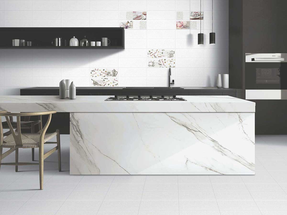
A straightforward, harmonious colour scheme for the kitchen is black and white. Use the classic combination of black accents and white basic pieces. White and black tiles in a mix-and-match pattern on your walls or as a backsplash? A total beauty! The kitchen's high-contrast colour palette can be grounded by the distressed blonde wood finish of the island, which will also anchor the room. A white vitrified tile countertop and white-tiled walls will provide consistency and balance throughout.
Light blue with grey and white
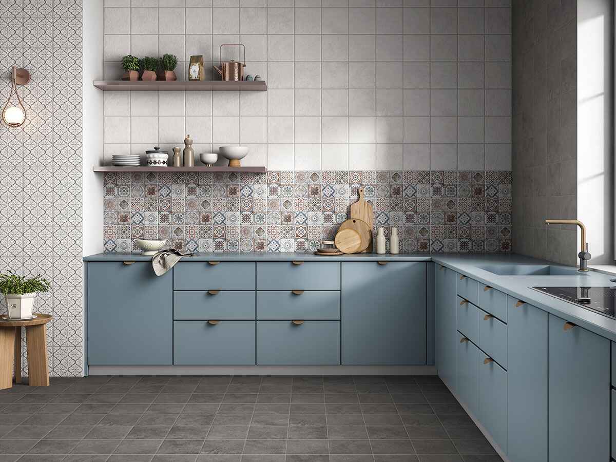
A light-blue island paint hue can be starkly contrasted with a white vitrified tiled countertop surface. Backsplash grey tiles can give your kitchen the extra oomph, keeping everything grounded and cosy. The space can be more defined with the use of metal drawers and cabinet handles.
Also Read: 25 Single Floor House Designs: Best Marble and Tiles Design
Sage green with grey and white
For a contemporary kitchen tile colour scheme, combine dark grey with sage green. Grey should be used for more permanent features such as vitrified tiled flooring while sage green should be used for interchangeable accents such as island stools, rugs, artwork, and countertop accessories. Balance the hue with plenty of white on top of cabinetry, walls, or backsplash to avoid an overwhelmingly somber impression.
Tips for Choosing the Best Tile Color for Your Kitchen Walls
- Start by looking at your cabinets and countertops – if they’re dark or bold, go for lighter wall tiles to create contrast. On the other hand, if your setup is neutral or white, you can explore deeper shades, such as terracotta, slate blue, or forest green, for a bold look.
- In small kitchens, the best tile colour for kitchen walls is usually a light tone, such as ivory, cream, or pale grey, which helps make the space feel larger and brighter. If your kitchen gets strong natural light, cooler kitchen tile colour options can tone down the warmth.
- For a timeless look, whites, creams, and soft greys remain the best colour for kitchen tiles, blending effortlessly with most decor styles. The goal is to find a colour that complements, not competes with, your kitchen elements.
Also Read: 10 Best Modular Kitchen Tile Designs
Why Vitrified Tiles Are Perfect for Kitchens
If your kitchen sees daily cooking, occasional spills, and stubborn stains like turmeric, choosing the right kitchen tiles colour and material is key. Vitrified Tiles are one of the best tile colors for kitchen spaces that demand strength, style, and easy maintenance.
At Simpolo Tiles and Bathware, we offer vitrified options that deliver on all fronts. The Kitchdeck collection is built for high-use areas, combining durability with elegant finishes. For a modern twist, the Saga collection offers sleek designs that complement various kitchen tiles colour themes. These vitrified tiles are also suitable for commercial kitchens and high-traffic areas, where both hygiene and durability are top priorities, maintaining their finish even under daily wear and tear. Whether your style is classic or contemporary, these collections help you create a kitchen that looks great and performs even better.
Light vs Dark Kitchen Tiles: Which Colors Is Right for You
Unsurprisingly, white is the most preferred kitchen tile colour for kitchen decor. It can fit into virtually any style and is welcoming, open, and light. Due to its timeless appeal and adaptability, a white kitchen is particularly appealing to visitors.
While dramatic hues like black, charcoal, navy, terracotta, and teal are becoming more and more trendy lately for kitchen cabinets and walls (particularly when coupled with white), white kitchens still have their place. Soft, natural colours like hazy blues, murky greens, and creamy beige are also very popular.
Light kitchen tile colours that reflect light, such as white, beige, and cream, create the impression that a room is larger because they make a space feel spacious and open. Dark hues, on the other hand, absorb light and tend to make it feel cosier.
Also Read: Kitchen Backsplash Tile Ideas for a Trendy and Functional Space
The Role of Lighting in Kitchen Tile Color Selection
Lighting significantly impacts how tile colors appear:
- Natural Light: Enhances true color perception. Light-colored tiles will look bright and expansive.
- Artificial Light: Incandescent light adds warmth; fluorescent light can make colors seem cooler or muted.
- Sample Testing: View tile samples in your kitchen at different times of the day and under various lighting to ensure satisfaction.
Proper lighting combined with your chosen tile colors will elevate the ambiance and functionality.
Conclusion
To find the perfect vitrified tiles in any of the above-mentioned colours, Simpolo Ceramics has the perfect palette ready for you and your kitchen. Look into our wide range of vitrified tiles and you wont be disappointed! Visit Simpolo to know more. Kitchdeck and Saga are the best collections for the kitchen countertops.