Colour for Living Room as per Vastu: Harmonise Energy & Style
The living room is not just a space for social gatherings; it is the heart of your home where energy flows and first impressions are made. Selecting the right colour for the living room as per Vastu Shastra is essential to channel positive energy, foster harmony, and create a welcoming atmosphere. Whether you prefer tiles, paints, or furnishings, Vastu principles guide you to align your living space with natural elements and directional energies.
As a leading premium tile manufacturer in India, Simpolo Tiles & Bathware offers a wide range of tiles that comply with Vastu principles while meeting your design aspirations. Our collections enable you to create a living room that is both elegant and energetically balanced, promoting wellness and positivity..
Understanding the Role of Colours in Vastu Shastra
Choosing the right colour for the living room as per Vastu is more than an aesthetic decision; it is about creating an environment that supports well-being and positive vibrations. Vastu Shastra, the ancient Indian science of architecture and design, emphasizes the importance of direction and natural elements in shaping the energy flow within your home. By selecting Vastu-compliant colours, you invite harmony, balance, and a sense of peace into your living room.
In this guide, we will explore how to choose colours aligned with Vastu principles, considering the direction of your living room, the elements involved, and practical tips to blend personal style with ancient wisdom.
Why Vastu Principles Matter for Living Room Tiles ?
Vastu Shastra emphasises the interplay of directions, natural elements, and colour schemes to encourage positive vibes. In many homes, the living room is located in the southeast corner, which is considered the seat of the fire element. That’s why colour choices often revolve around warmth and serenity. Even if your living room sits in a different direction, paying attention to colour can help create a balanced look and feel.
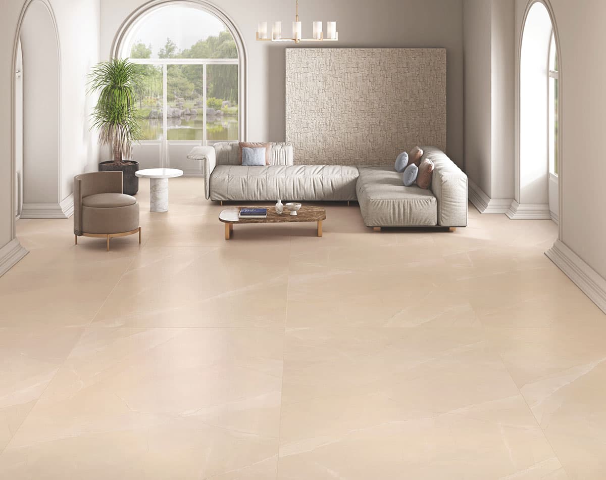
Some families go for lively hues to spark energy, while others prefer soothing shades for calmness. Tiles like Crema Marfil, with its understated elegance, often appeal to those who seek a blend of both. Meanwhile, more vibrant living room tiles such as Aliot Blue can stimulate creativity if used wisely in combination with neutral tones.
Understanding Basic Vastu Colour Principles
Vastu suggests that each direction in your home is ruled by a specific element—fire, water, earth, air, or space. Colour selections should be in sync with these elements. For instance,
- If your living room is in the south or southeast, warm colours such as shades of orange, red, or earthy browns are commonly suggested.
- If the living room is in the northeast, lighter shades like whites or yellows might be more suitable.
In practical terms, you don’t have to paint the entire space in a bright colour. Subtle tile choices can achieve a similar effect. Options like Nano White or Saga White can reflect light and help create a peaceful setting, whereas Desert Grey or Carra Grey can add an earthy feel when the direction calls for a more grounded colour palette.
Related Post : 12 Best Mirror Directions as Per Vastu for Home & Positivity
Understanding Directions: Choosing Living Room Colours as Per Vastu
Vastu Shastra divides space by directions, each ruled by an element influencing the energy of that zone. Selecting colours that resonate with these elements ensures balanced energy flow:
- North: Water element; green and blue shades encourage prosperity and calmness.
- Northeast: Air and water; light blue, white, and yellow foster spiritual growth.
- East: Air element; white and soft green promote freshness and creativity.
- Southeast: Fire element; pink, orange, and red energize the space.
- South: Fire element; red accents bring warmth without overwhelming.
- Southwest: Earth element; beige and brown provide stability.
- West: Space element; blue and white create calm and expansion.
- Northwest: Air element; grey and cream support sociability and balance.
Choosing the Best Living Room Tiles Colour as per Vastu
Choosing the best colour for the living room tiles often involves balancing personal taste with Vastu guidelines. Neutral tones are timeless and work well in most layouts. Our Fusonyx Dove tiles, for example, pair easily with different colour schemes while supporting a calm environment. This versatile shade doesn’t clash with bolder cabinet colours or stainless-steel appliances.
If you prefer to add flair, consider accent walls with something striking like Portoro Flame or Galaxy Azzurro. Keep the rest of the walls or floors in a subtler shade to ensure the overall aesthetic remains balanced. Even bright accent wall tiles, used sparingly, can adhere to Vastu principles when combined with warm undertones and placed strategically.
Floor tiles should also follow Vastu guidelines. Many prefer neutral or soft earthy tones on the floor to reflect warmth and stability. Our Crema Marfil or Mountain White floor tiles collections can help create a calm base for your living room, allowing your cabinetry and counters to take the spotlight.
The living room floor also needs to be slip-resistant, easy to clean, and durable. Even the most Vastu-aligned colour scheme won't help if it doesn't stand up to the wear and tear of daily life. Vitrified tiles are generally good picks for their resilience and low maintenance requirements.
Emphasising Natural Light and Reflective Tiles
Vastu also stresses the importance of natural light in promoting positivity. Reflective surfaces, like glossy tiles, can make a compact living room look more spacious and welcoming. Our Statuario Gold or Golden Silk White collections can beautifully enhance natural light, creating an airy environment. If you enjoy a modern style, you might love the sleek finish of Metal Grey or Antique Grey, which also blends well with stainless-steel appliances.
If your living room lacks natural light, placing glossy living room wall tiles near the windows or doors can bounce around the little light you do have. This technique brightens the room and increases the flow of positive energy. Pairing a glossy tile with a matte-finish countertop can create a pleasant contrast, especially if you choose neutral or warm shades.
Related Post : Wall Clock Direction as Per Vastu: Ideal Placement & Colour Tips
Balancing Fire Elements with Cooler Tones
If you’ve opted for bright or warm-coloured cabinetry, cooler tiles like Carrara Neo Bookmatch or Carra Grey can mellow the overall tone. Likewise, if you have light-coloured cabinets, you can go a bit bolder with the backsplash or floor using something like Black Antique or Ocean Black in smaller doses.
Don’t be afraid to mix textures. A textured tile such as Sandstar or Silver Root can add another layer of interest to a simple colour scheme. These subtle textures can tie together different elements like wooden cabinets, chrome fixtures, and glass accessories—into one coherent design.
Using Accent Tiles Wisely
Some people worry that Vastu guidelines might limit their style, but that doesn’t have to be the case. You can still play with accent tiles to bring personality to your living room. For example, a few strategically placed accent tiles like Caster White_Caster Blue_Caster Crema_Caster Wine or Prozzo Pista_Prozzo Rose can add a pop of colour and keep your space in line with Vastu's suggestions.
Choose an accent colour that aligns with the direction of your living room. If it faces southeast, you can incorporate earthy reds or terra cotta accents. If it faces east, a dash of green or light blue might complement the natural morning light that often graces east-facing living rooms.
Related Post : Kitchen Colour as Per Vastu: Best Colours & Tile Choices for Harmony
Do’s and Don’ts for Living Room Colours as Per Vastu
|
Do’s |
Don’ts |
|
Choose colours that complement your living room décor style. |
Avoid excessive dark or intense colours like black and deep reds. |
|
Use paint or tile calculators to estimate quantities accurately. |
Do not mix clashing elements (e.g., fire colours in water-dominated corners). |
|
Align furniture placement and materials with directional elements. |
Avoid overly glossy finishes in northeast or east corners to maintain calm. |
|
Incorporate natural light and reflective surfaces to enhance energy flow. |
Refrain from overwhelming the space with too many bold accents. |
Conclusion
Designing a vastu-aligned living room is about finding the perfect balance between aesthetics, functionality, and energy flow. Tiles like Golden Silk White, Calacatta Rose, and Prozzo Pista from Simpolo Tiles & Bathware offer versatile options that adhere to Vastu principles while elevating the overall look of your space.
Our tools like Digital Showroom and 3D Visualiser, and collections make it easy to experiment with colours, textures, and layouts, ensuring your living room feels harmonious and welcoming.
Whether you prefer the warmth of earthy tones or the brightness of whites, aligning your living room tiles' colour as per Vastu principles can enhance your home’s energy and create a positive environment for cooking and bonding.