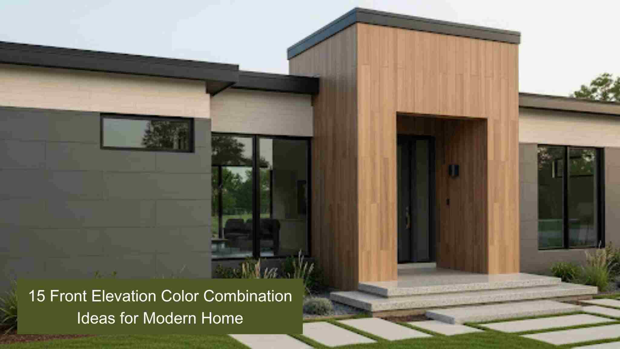
15 Front Elevation Colour Combinations for Modern Homes
The front elevation sets the tone for your home’s style and personality. In 2025, homeowners are embracing creative tiles colour combination for front elevation to boost curb appeal and stand out. This guide explores trending palettes, timeless ideas, and expert tips tailored for Indian homes to help you make a lasting first impression.
Colour Combinations for Front Elevation
We’ve handpicked these combinations based on real-world preferences in Indian cities, considering both climate resilience and trending design directions. Whether your home is in a hilly region, a coastal town, or a hot plains city, there’s something here that will fit both your taste and your setting with elevation tiles enhancing the overall look..
1. White and Indigo
There’s a timeless charm to white walls, especially when enriched with deep indigo trims or patterned tiles. Indigo brings depth and sophistication, whether on balcony grills, parapets, or tiled accent panels. For a fresh, refined pairing, combine our Spectra Salt collection with Onice Misty to create a cool, clean aesthetic that complements both metal and wooden doors with ease.
2. Purple, Lavender, and White
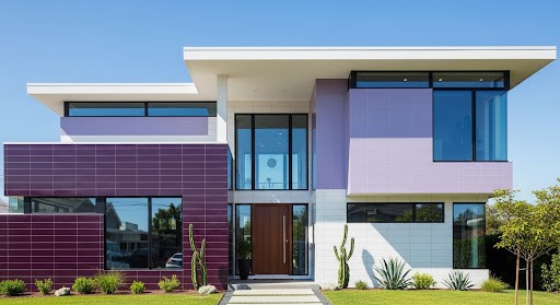
This trio stands out as a unique combination, especially if you want to stand out with minimalist beige houses. Lavender keeps things subtle, purple adds depth, and white tiles everything together while adding a unique contrasting element to the whole. These tones shine exceptionally well with smooth, satin-finish tiles, ideal for duplexes and corner homes where you want gentle distinction.
3. Red and Cream
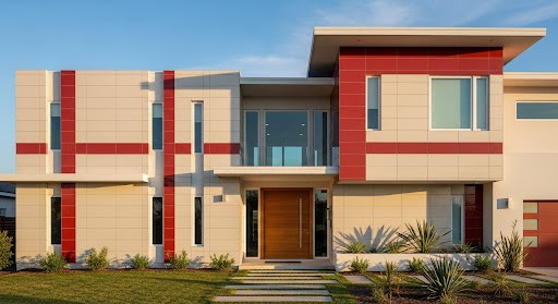
When you think of red and cream, terracotta tile roofs, sandstone columns, and hand-carved wooden doors come to mind. Our Burnt Brick tiles mimic this charm perfectly. Perfect for traditional Indian homes or villas with cultural roots, the warmth of red against neutral cream creates familiarity with an elegant flair. This timeless pairing also enhances curb appeal, making your home stand out while feeling instantly welcoming.
4 . Grey and Orange
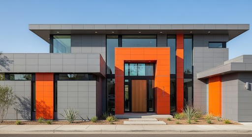
Grey tiles are practical and cool, while orange brings a contrasting, vibrant personality. Together, they strike an edgy, modern balance. If you live in an urban layout and want your house to reflect bold choices, this combination works wonders if you use subtle surface designs to add drama without clutter. The industrial appeal of grey paired with vibrant orange accents brings boldness while maintaining a sleek, sophisticated edge.
5 . Forest Green, Lime, and White
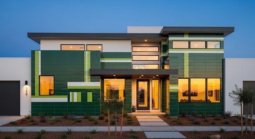
Perfect for homes embraced by greenery, this nature-inspired trio blends depth, vibrancy, and harmony. Forest green tiles bring a grounded richness, lime adds a lively burst of energy, and white keeps the palette balanced and fresh. For the best effect, choose textured tiles with matte green for expansive areas and glossy lime accents on columns to create a look that feels both vibrant and effortlessly connected to nature.
Related Post: Wardrobe Colour Combination Ideas to Match Your Bedroom Decor
6 . White and Peach
White tiles and peach tiles create a soft, luxurious charm that feels both modern and timeless. Perfect for urban homes seeking warmth and simplicity, this pairing adds brightness without overwhelming the senses. Use peace matte finish tiles on lower elevations with crisp white above to visually heighten the facade. At sunset, the combination glows beautifully, enhancing the home’s airy, welcoming appeal.
7 . Yellow and Cream
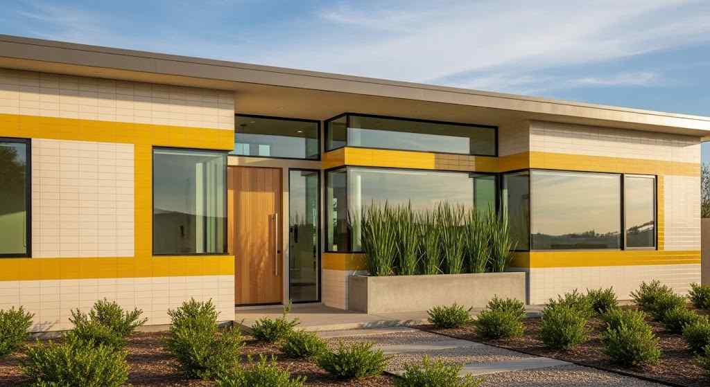
Yellow brings a cheerful burst of energy, while cream tiles soften it with a refined, calming touch. This front elevation colour combination feels fresh and inviting, making it ideal for small or medium-sized homes that want brightness without overpowering the exterior. Pair ceramic textured tiles or stone-effect finishes in these tones to create a warm, natural look that instantly feels welcoming.
Related Post: Best Colour Combinations with Yellow Walls for Home Decor
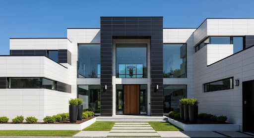
8 . Charcoal Grey and White
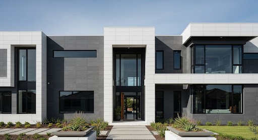
For contemporary homes with a love for minimalism, charcoal grey and white make a striking pair. The deep, moody tones of our Storm Grey tiles contrast beautifully with crisp white paint or grout lines, creating bold, defined edges. This combination delivers a clean, polished finish that shines in angular or boxy layouts, giving the exterior a sophisticated, modern presence.
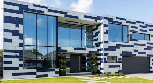
9 . Grey and Blue
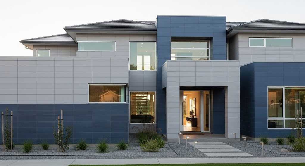
There’s a calming vibe when you choose grey and blue tiles as your front elevation colour combination. Soft grey walls tiles with ceramic blue inserts or tile stripes across balconies suit coastal towns or homes with an open, breezy layout. The trick is to use a light, powdery blue along with grey Stylonyx tiles from our collection.
10 . Oyster White and Pale Blue
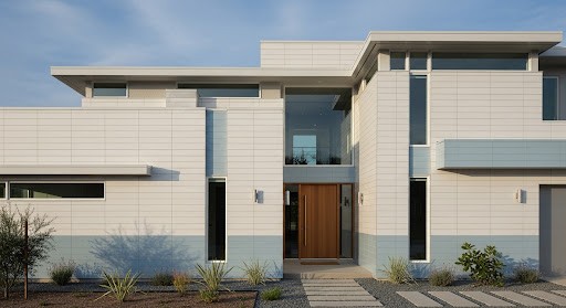
White is often seen as a symbol of elegance, but adding blue in the mix amplifies the design. Roman White keeps the design classy while pale blue adds that cool touch. It is ideal for houses with lots of open balconies or terrace areas. We recommend this for people wanting a clean, polished home front with European charm.
11 . Mustard Yellow and White
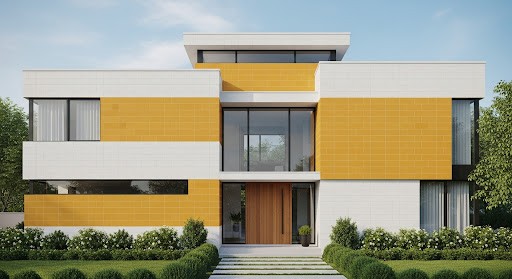
Mustard yellow offers warmth and vibrancy without the quick fading of brighter shades, making it perfect for Indian conditions. Paired with pure white, it creates a joyful, clean, and inviting exterior. This combination is especially suited for small plots or narrow street-facing homes, as it resists dust and pollution while ensuring your facade stands out with a cheerful, eye-catching appeal.
12 . Shades of Brown and White
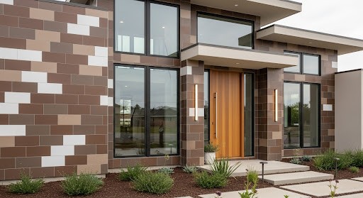
Brown and white create a warm, classic exterior reminiscent of a charming “chocolate box” style facade. Layer rich, darker browns on the lower half with lighter browns or crisp white trims above for a balanced, inviting look. This white and brown tile's colour combination for front elevation exudes comfort and sophistication, making it ideal for homes that want to feel grounded, welcoming, and timeless in their appeal.
13 . Black and White
Black and white is a timeless pairing that delivers crisp contrast and undeniable drama. For a sleek, modern edge, use matte black tiles with minimal joints from our Cheppo Nero series, paired with clean white surfaces. This combination offers a high-end look with minimal upkeep, making it perfect for urban homes that embrace contemporary, minimalist design while standing out with effortless sophistication.
14 . Olive Green and Brown
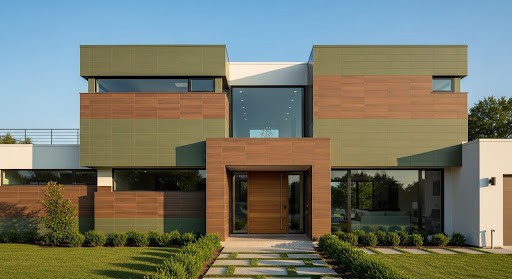
Perfect for homes in natural settings, the pairing of olive and rich brown creates a grounded, serene exterior. Olive offers a calm, understated backdrop, while Cast Rust tiles from our collection bring texture and depth. This earthy combination ages beautifully, blending effortlessly with stone or brick tiles to give your home a timeless elegance that feels at one with its surroundings.
15 . Multi-Colour Combination
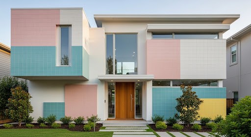
For taller homes or those with a creative spirit, using multiple colours can create a genuinely unique facade. Soft pastels like pink, teal, and yellow, applied sparingly across different elevation segments, add artistic charm without overwhelming the design. Vary shades subtly between floors and choose floor tiles with gentle finishes to maintain a sophisticated, cohesive look that feels both playful and thoughtfully designed.
Advanced Materials for Modern Front Elevation Colour Design
A sophisticated front elevation colour combination is often achieved through a mix of textures:
- Wood-Look Vitrified Slabs: Offer the warmth of natural timber without the risk of termite damage or moisture rot.
- Sintered Surfaces: High-performance, thin slabs that are nearly impervious to weather and stains, offering a seamless front home colour experience.
- Textured & 3D Elements: Ideal for creating a focal point on a single elevation wall, adding depth and shadow play.
Expert Tips for Choosing Front Elevation Colours
- Refer to the colour wheel to understand complementary and contrasting combinations that enhance your home’s appeal.
- Test samples in natural light at different times of the day to see how colours truly appear on your facade.
- Balance textures and finishes; mix matte, glossy, or stone tiles to add depth without overwhelming the design.
- Match the palette with your architectural style and consider surrounding landscapes, whether urban, coastal, or nature-rich.
- Use darker tones sparingly to avoid making the exterior look smaller or absorbing too much heat.
- Highlight key features such as trims, doors, or balconies with accent colours for visual interest.
- Consult design professionals to ensure your chosen palette works harmoniously and aligns with long-term maintenance needs.
Maintenance & Longevity of Front Elevation Colours
To preserve the integrity of your front home colour, follow these professional maintenance protocols:
- Atmospheric Cleaning: Periodically wash surfaces to remove salt deposits and pollutants, especially in coastal or industrial areas.
- Grout Integrity: For tile-based elevations, ensure grout lines are sealed to prevent water seepage and microbial growth during monsoons.
- LRV Monitoring: If using paint, be aware that dark colours (low LRV) absorb more UV radiation and may require more frequent updates than vitrified cladding.
Conclusion
Choosing the right front elevation colour combination not only boosts curb appeal but also adds value and reflects your personality. The ideas above go beyond passing trends, offering timeless inspiration for a home exterior you’ll love for years. From selecting the perfect palette to finalising textures and finishes, our experts guide you every step of the way. Let’s create a front elevation that’s as unique and welcoming as your home deserves to be.