Best Study Room Colour Combinations with Matching Tile Designs
Choosing the right study room colour combination can greatly influence focus, mood, and overall productivity. Soft blues, muted greens, or warm neutrals can create a calm, distraction-free zone ideal for reading or working. But colour alone doesn’t complete the space—tiles play a key role in tying the look together. At Simpolo Tiles and Bathware, we offer tile designs that complement a wide range of study room palettes. Whether you prefer minimalistic tones or textured finishes, our collections help bring balance and style to your study area, making it not only functional but also visually appealing.
Creative Study Room Colour Combinations Ideas
Choosing the right study room colour combination can greatly impact how focused, calm, or energised you feel while working. Whether you need a quiet space for deep thinking or a motivating corner to beat procrastination, colour and tile pairings can make all the difference. At Simpolo Tiles and Bathware, we recommend treating wall colours and wall tiles designs as a single visual unit to create harmony in your study space.
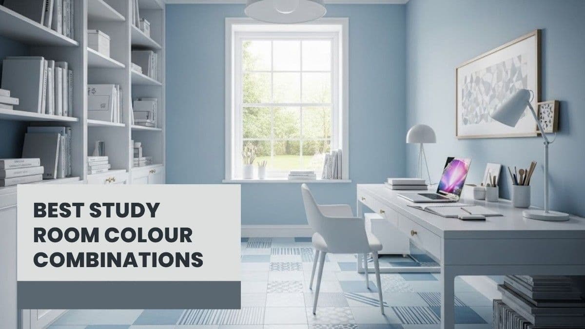
1. Calm and Focused with Blue and White
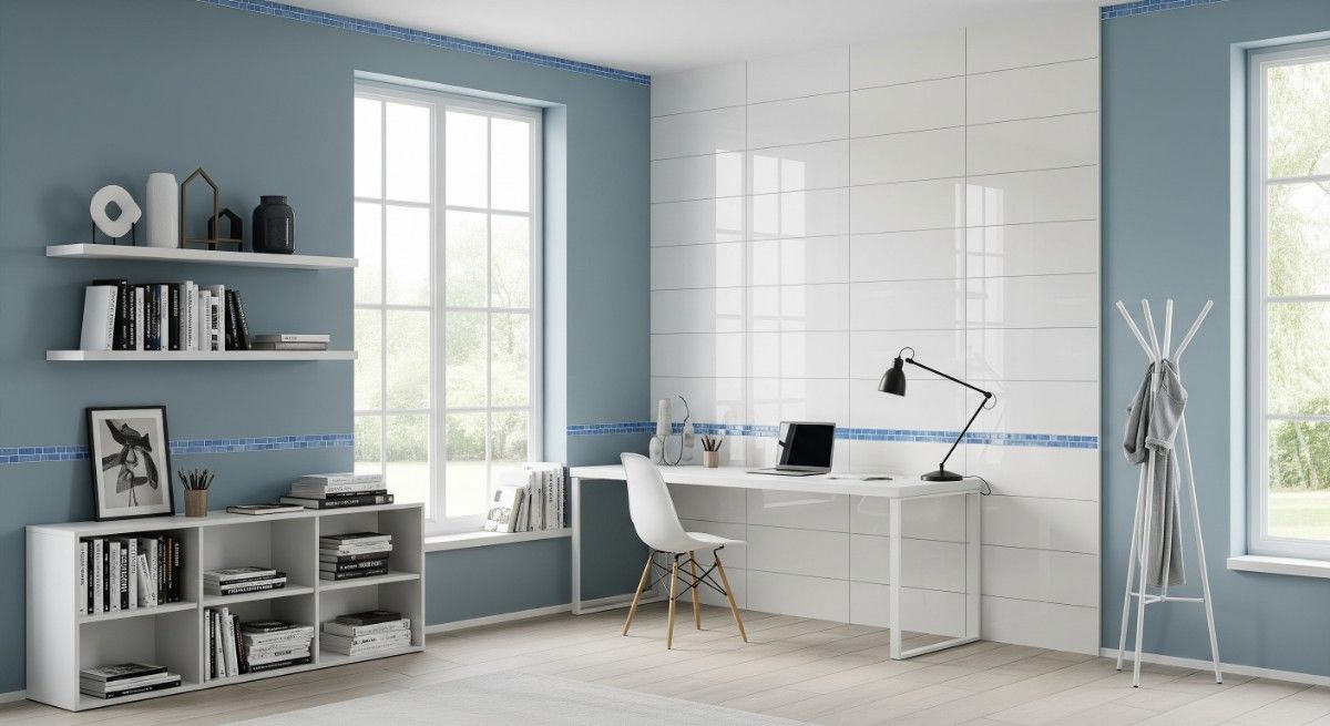
Blue promotes mental clarity and calmness, making it perfect for long reading or study sessions. Paired with white, the room feels light and spacious.
Tile ideas: Glossy white tiles like Matrix White with subtle soft blue accent tiles.
2. Vibrant and Energetic with Yellow and Grey
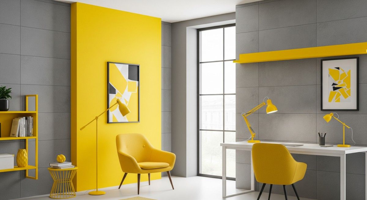
Yellow boosts energy and keeps your mind alert. Grey balances this brightness and brings a sense of control.
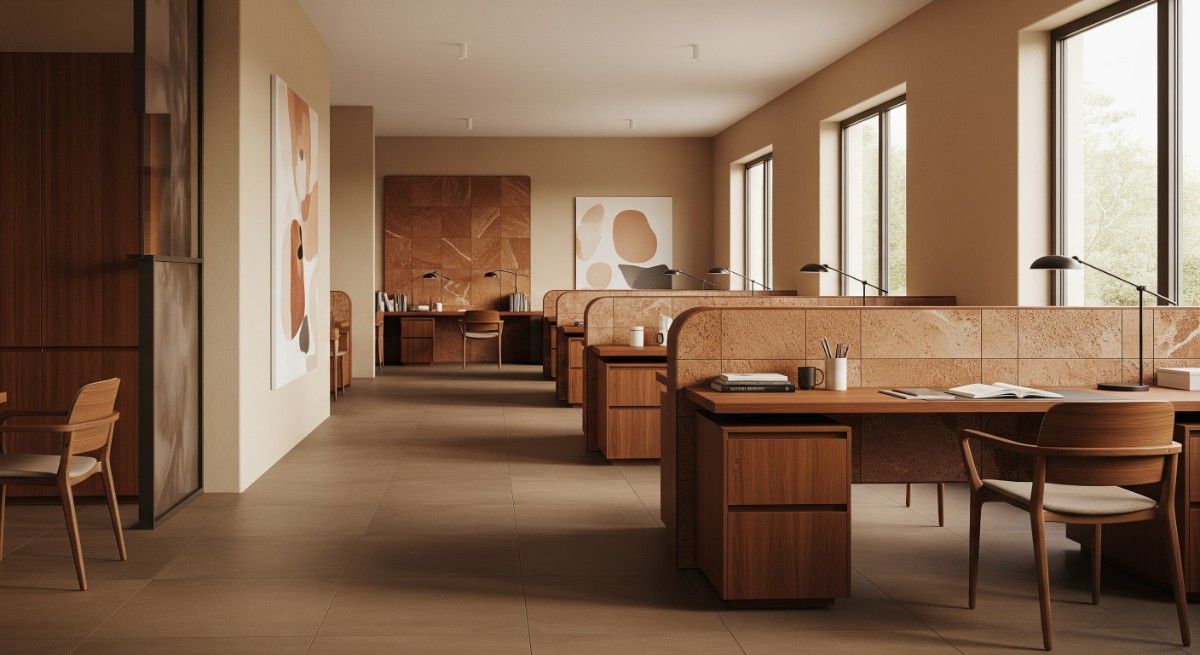
Tile ideas: Matte grey tiles combined with yellow-accented patterns or geometric designs. For a more defined and modern contrast, subtle use of black color tiles can ground the brightness and add visual depth to the study room design.
Related Post : 10 Wall Colour Combination to Transform Your Living Room
3. Natural and Grounded with Green and Beige
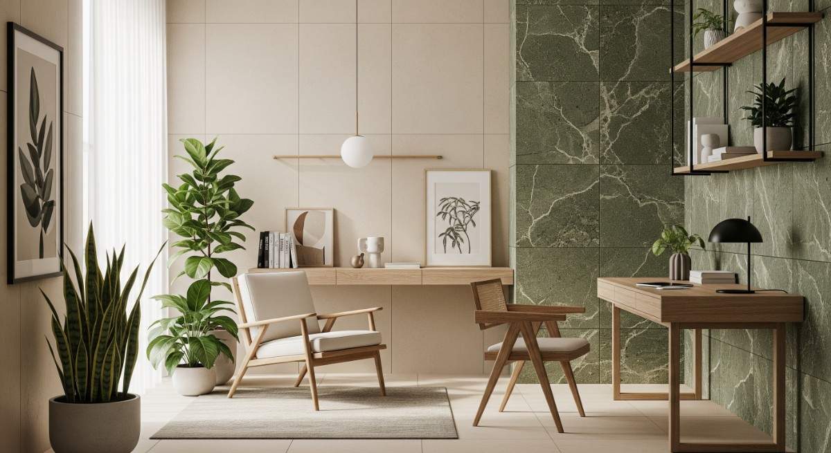
Green connects with nature and helps improve concentration, while beige adds warmth and softness.
Tile ideas: Neutral tiles like Saga Bianco paired with green textured or stone-feel tiles for a calm, earthy space.
Related Post : How to Choose the Best Wall and Floor Tile Colour Combinations
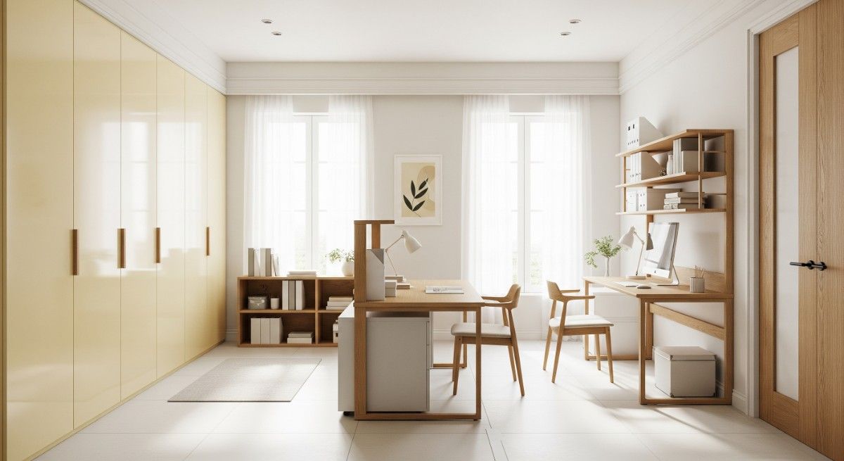
Innovative Tile Design Ideas to Match Your Study Room Colours
Your tile choice can lift your whole space. It adds depth and texture, and when grounded by the right floor or balanced with a feature wall behind the desk, students focus better in such rooms.
1. Textured Tiles for Added Depth
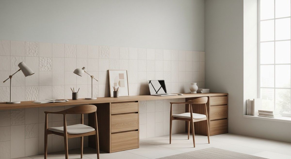
Textured tiles bring in subtle detail and warmth, especially in pale-coloured rooms. For off-white or toned walls, cream colour tiles matte or embossed tiles like Framenta or Oblique Beach add character while reflecting enough light to keep the space bright and inviting.
2. Geometric Patterns for a Modern Touch
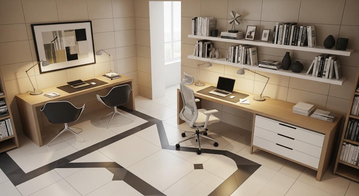
Geometric pattern tiles work well for study rooms that also serve as work-from-home zones. Beige wall tiles paired with cream tiles featuring charcoal or taupe geometric patterns gives a modern, clean look—perfect for focused productivity.
3. Nature-Inspired Tiles for Tranquillity
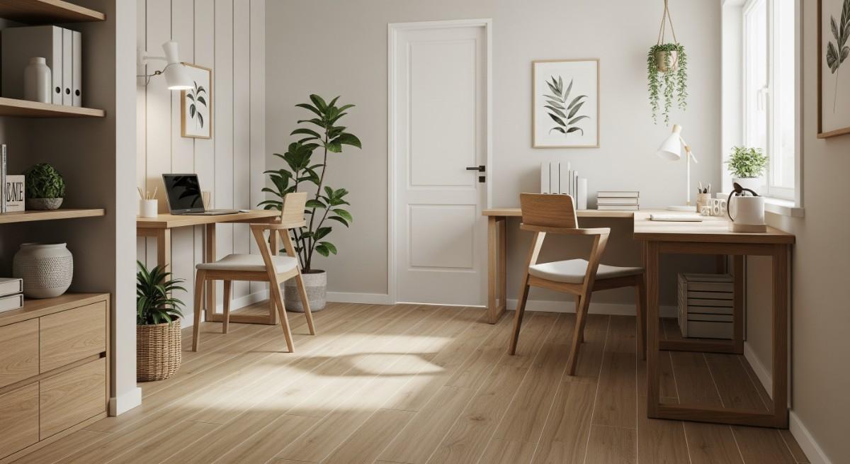
Wood-finish tiles offer a grounded, serene look ideal for minimal interiors. They give the study room a homely feel without overwhelming it with colour. Our range of natural wood tiles,pairs beautifully with soft wall shades to create a calming, distraction-free environment.
Tile Finishes to Consider
|
Tile Finish |
Benefits |
Suitability |
|---|---|---|
|
Matte |
Non-glare, hides dirt, anti-slip |
Study floors, high-traffic walls |
|
Glossy |
Reflective, brightens the space |
Feature walls, accent tiles |
|
Texture/Embossed |
Adds depth, tactile interest |
Accent wall tiles, decorative areas |
|
Wood-look |
Natural warmth, durability |
Floors and walls, complements natural tones |
Vastu-Based Study Room Colour and Tile Combinations
If you believe in Vastu, your study room colour combination should be arranged accordingly and have a deeper meaning. Some shades are linked to better focus, others to clarity or calm.
1. Colours for Clarity and Knowledge
In Vastu, light yellow, off-white and cream are said to improve learning and attention. They’re linked to the northeast side of the house, which Vastu connects with mental clarity.
Even if you're not strict about Vastu, these colours can be a good option, as they don’t distract and reflect light well. For tiles, light yellow tiles or cream gloss or matte finishes work best. We usually recommend pairing these with white walls and a few wooden elements.
2. Harmonising with Earthy Tones
The colour of study room according to Vastu should lean towards brown, terracotta, and beige, as they are earthy tones. Even for any rooms beyond the study areas, these colours are known for promoting balance and focus. Brown tiles , terracotta, or a natural stone-like tile goes well with these tones.
Related Post : Modern Colour Combinations for Living Room Design Transformations
Combining Practicality with Aesthetics: Matching Tiles for Functionality and Style
More than the style factors, study areas bear a lot of movement of chairs, spilt ink, and footfalls to and fro. The tile design you choose here has to hold up in every situation.
1. Anti-Slip Tiles for Safety and Style
If the study space is meant for children or older parents, choose tiles that promote slip resistance. We often suggest non-glossy or lightly textured tiles for such rooms. Colours like grey, beige, or muted tones are soft on the eyes and safe underfoot. Some of our matte-finish collections, like Alta Khaki or Ladakh Barley, suit the anti-slippery conditions.
2. Low-Maintenance Tiles for Busy Study Spaces
Using a room daily means dust, crumbs, and pencil marks piling up. You need a floor in ceramic or porcelain tiles that doesn’t show every bit of dirt. These materials clean fast and don’t scratch easily.
You can try white floor tiles with a soft border. This keeps the middle of the room bright but hides dirt along the edges. In home libraries or open-plan bedrooms with a study desk, this idea works effectively.
What to Consider When Selecting Tiles for a Study Room
- Durability: Choose tiles resistant to scratches, stains, and regular wear.
- Maintenance: Low-maintenance tiles save time—glazed or vitrified tiles repel dust and stains.
- Slip Resistance: Especially important for children’s study rooms or homes with elders.
- Size and Finish: Medium to large tile sizes (300x600 mm, 600x600 mm) reduce grout lines and create a seamless look.
- Colour Palettes: Tiles should complement or subtly contrast wall colours for balance.
Conclusion: Bringing Ideas to Life
A well-designed study room is about creating a space that helps you or your children stay focused and inspired. The right study room colour combination paired with carefully chosen tiles can make that happen.
We, at Simpolo Tiles and Bathware, believe that your space should reflect who you are. Whether you lean towards calm blues or vibrant yellows, we’ve got tile solutions that not only match but also enhance your room. Bring in the comfort, the creativity, and the calm, all through colour and tile choices that suit how you live. Make it personal and functional with us.
Related Post: 15 Tips to Select the Best Tiles for Living Room


