10 Wall Colour Combination to Transform Your Living Room
Colour shapes the mood and energy of any room, especially the living area where we spend quality time with loved ones. Selecting a wall colour combination for the living room can certainly feel a bit challenging, but it presents a chance to add style and comfort to your home. Whether you prefer calming neutrals or daring contrasts, there’s a shade pairing for every taste.
If you’re considering a two-colour combination for walls, you’re likely looking for a balanced result, something that’s eye-catching but not overwhelming.
10 Best Color Combinations for Living Room Wall
Let’s explore 10 ideas for wall colour combinations for living room that can spark inspiration for your next living room makeover. Along the way, we’ll also see how Simplo Tiles & Bathware’s tiles can add character to any space, be it through accent walls or decorative corners.
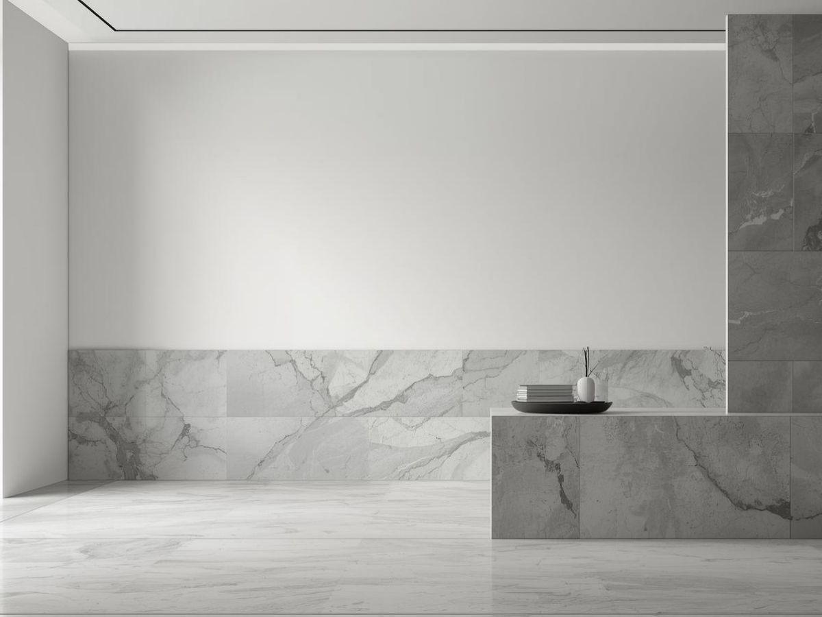
1. Neutral Beige and Cream for an Airy Setting
 Beige and cream are timeless choices for those who love a bright, airy living space. Beige grounds the room, while cream adds openness and a sense of calm. This combination works well in smaller areas because lighter walls tend to make rooms appear larger. Our collection offers Crema Marfil for a subtle warmth that pairs seamlessly with Prozzo Biscuit if you want a slight colour variation on different walls.
Additionally, consider accent elements like Statuario Hoist or Miele Onyx tiles around a fireplace or behind a display unit to extend the neutral palette in a more textured way. These living room tiles blend in and yet elevate the overall look with their understated elegance.
Read Also :How to Choose the Right Kitchen Tile Color
2. Dusky Pink and Midnight Blue for Elegant Vibes

Nothing sets an elegant yet sophisticated tone like dusky pink paired with midnight blue. The pink softens the intensity of blue, resulting in a refined backdrop for artwork, statement furniture, or even your favourite indoor plants. If you want to incorporate a tile element, you can experiment with Traventino Corn, Traventino Red, or Fluid Melange to create a striking feature wall or use them to frame a large mirror.
A corner of the room might feature a decorative tile arrangement from our Spectra Salt _ Spectra Peanut_Spectra Cumin series for a creative highlight. This approach ties the bold blue and gentle pink together without clashing.
3. Earthy Green and Warm Brown for a Natural Look

Earthy green, paired with a warm brown, lends a cosy, natural feel. This colour combination for living room is perfect if you love indoor plants or have a rustic theme. The green tone reminds you of nature, while brown adds the warmth of wooden finishes. You can build on this look with a tile accent, uch as a small area featuring green tile or designs like Ironwood_Beige_Brown , Earthstone Beige_Verde_Choco to highlight the organic theme.
For a slightly lighter variation, Forza Tropical Sun can act as a contrasting floor tile that keeps the space balanced and welcoming.
4. Grey and White for Modern Sophistication
Grey and white is a classic combo for those seeking a modern, minimalist look. White brightens the room, while grey brings in a sleek touch. Our Staturio Enfold_Burberry Gris, Passion Grey or Armani Dove can accent the white walls with a refined texture. For a more dramatic statement, a subtle marbled tile like Bookmatch_2001 can form an accent strip, giving an instant lift to plain grey surfaces.
If your style leans slightly industrial, you can add an exposed brick veneer on one wall or incorporate Concrete Camel tiles in a small section to enhance the urban feel.
Read Also: Modern Colour Combinations for Living Room Design Transformations
5. Yellow and Grey for a Contemporary Twist
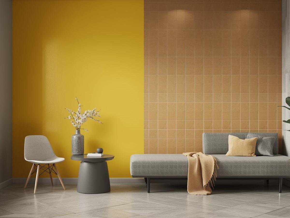
Yellow is cheerful; grey is composed. Put them together, and you have a lively yet balanced room. One wall can take a sunny shade that brightens the space, while the other walls stay neutral with grey. This is one of the best color for living room walls if you want to go bolder, pair a bright accent tile like Armani Sun or Brescia Tan with the yellow section.
To add dimension, consider placing a few decorative items in the same yellow tone or incorporating yellow tiles within the design, while introducing throw pillows that echo the grey colour. This keeps the theme cohesive and polished.
6. Mint Green and Off-White for a Refreshing Ambience

Mint green feels refreshing and light. When combined with off-white, your living area can look cosy without feeling cramped. Mint offers a slight pop of colour compared to a plain neutral palette. Our Queen Mint tiles can match or complement a wall in a similar hue, possibly around a TV unit or an indoor fountain feature. Meanwhile, an off-white shade like Perlato White or white tile on the surrounding walls keeps the space bright and open.
This pairing is especially good if you love minimalistic interiors but still want a little bit of personality. Plants, wooden furniture, or a rattan bench add to the charm of mint’s breezy vibe.
7. Red and Beige for a Bold Statement
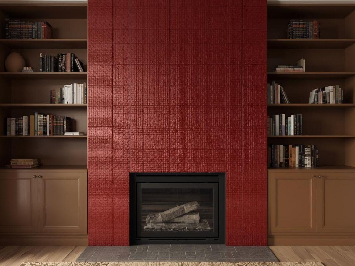
Red is powerful, so balancing it with beige tones can prevent it from becoming overpowering. A deep red accent wall sets the stage, while beige on the other walls maintains harmony. Our TERRA RED tile or a similar toned shade like Spectra Chilli_Spectra Wine can be used on a smaller section of the wall, behind a bookshelf, or around a fireplace.
For the floors, you can opt for a neutral red tile like Pozzolana Smoke or Crema Dinova, ensuring the red remains the focal point without clashing with the rest of the decor.
8. Navy Blue and White for a Nautical Theme

Navy blue and white is a classic combo that reminds you of coastal homes and breezy holidays. Painting one wall navy blue while keeping the others white can create a soothing yet bold look. You can also add blue tiles as part of the design, or use tile accents like Miracle White, Miracle Rose, Miracle Cream, Miracle Red, Miracle Blue, Miracle Black, or Prozzo Dove_Prozzo Italian around a window or along a baseboard for a subtle design twist.
To complete the nautical theme, accessorise with striped cushions and maybe a few seashell ornaments. This duo also pairs nicely with natural wood or rattan furniture, creating a balanced maritime vibe.
Read Also : 15 Tips to Select the Best Tiles for Living Room
9. Brown and Gold for a Touch of Luxury

Brown exudes warmth, and gold brings luxury. A brown wall can serve as a rich backdrop for golden accents in frames, lamps, or decorative pieces. If you want a grand effect, you could tile a fireplace or decorative niche with Antique Oro or Marmo Opera from our collections. This approach adds dimension and reflects your style subtly yet lavishly.
To prevent the room from looking too dark, keep at least one wall or ceiling in a lighter tone, such as off-white or cream. That ensures the gold details pop without overwhelming the space.
10. Pastel Peach and Sage Green for Subtle Elegance

For a soft, charming space, pastel peach and sage green work wonders. Pastel peach brings warmth without feeling intense, while sage green introduces a relaxing vibe. You can highlight a small corner or a half wall with CRV 3034_CRV 3037 or Michelangelo Rena tiles if you want a bit more texture.
This pair is perfect for smaller living rooms, especially if you incorporate airy curtains and minimalistic wooden furniture. By connecting the colour of your furnishings to the sage and peach palette, you create a unified, calming look.
Emerging Trend in Wall Colour Combination for Living Room in 2026
Indian interior design trends are embracing rich, earthy tones and sophisticated palettes inspired by cultural heritage and natural elements. Here are the top three feature wall colour trends to consider in 2026:
- Deep Emerald Green: Inspired by India’s lush landscapes, this jewel-toned green symbolizes growth and prosperity. Ideal for accent walls, it pairs beautifully with gold accents or neutral furniture, creating a luxurious and nature-inspired focal point, especially in compact urban homes.
- Warm Terracotta (Dusty Sienna or Brick Red): Evoking the sun-baked earth and festive motifs of Rajasthan, terracotta adds cozy, grounded energy to your space. Use it on a single wall to bring rustic charm without overwhelming smaller rooms. It aligns well with Vastu principles promoting stability.
- Inky Navy Blue (Midnight Blue): This deep, calming blue reflects twilight skies and offers a regal touch. Perfect for media walls, it pairs with subtle metallics to enhance natural light, especially suitable for monsoon-prone Indian climates.
These trends emphasize bold yet balanced palettes that foster well-being and timeless elegance.
How To Choose the Best Color For Living Room Walls?
Before finalizing your colour combination for living room walls, you need to consider:
- Room Size: Small rooms benefit from light colours to appear spacious, while larger rooms can handle darker, richer tones.
- Mood and Aesthetic: Decide if you want a relaxing, energetic, elegant, or cozy atmosphere and choose colours accordingly.
- Paint Finish: The finish affects the look and durability. Matte hides imperfections, satin adds sheen, and glossy is durable and easy to clean.
Conclusion
Choosing the right wall colour combination can significantly transform your living space, improving both its aesthetic appeal and functionality. Whether you prefer soft neutrals, bold contrasts, or vibrant hues, Simpolo Tiles and Bathware offers a diverse range of options to suit every taste and style. Utilise our Digital Showroom and Virtual Space Creator to experiment with different colour combinations and tile patterns. From timeless greys and elegant blacks to vibrant greens and cosy earthy tones, our collections featuring options like black tiles for statement walls or Full Body Tiles for long-lasting durability ensure you find the perfect two-colour combination for walls in your home.