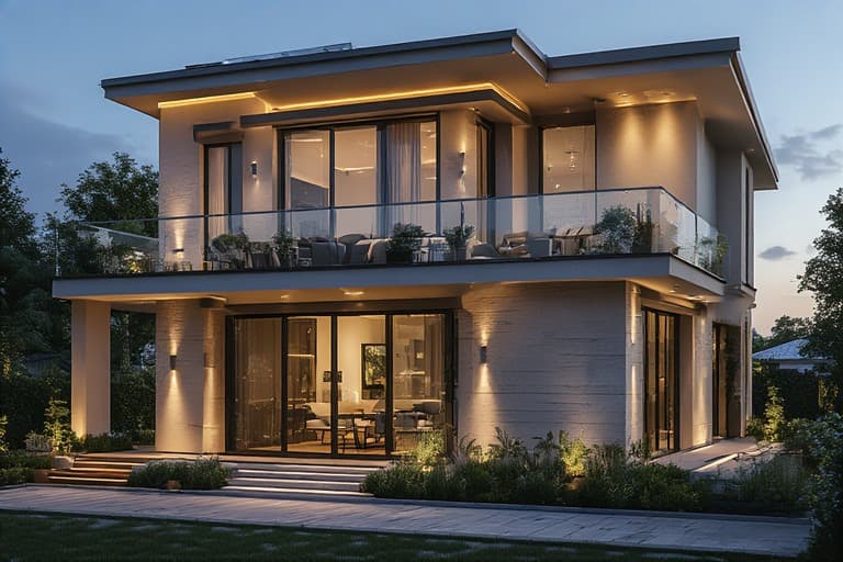
Top 10 Window Colour Combinations for Modern Homes

The right window colour combination can dramatically transform the look of a modern home, balancing style with personality. Windows, along with matching doors, are more than functional—they anchor the overall design theme. When thoughtfully paired with tiles—whether on the floor, walls, or façade—they create a cohesive and elegant aesthetic. In this blog, we explore the top 10 trending door and window colour combinations that work beautifully with contemporary tile designs. Get inspired with expert tips on how to harmonise colours, textures, and finishes for a truly modern look.
1. Ivory White Windows + Charcoal Grey Walls with Beige Tiles
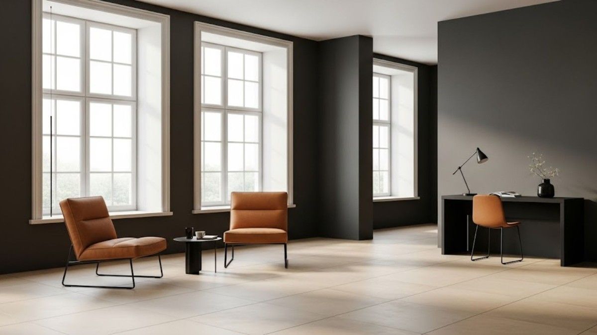
Ivory-white windows soften the darker tone of the charcoal-grey walls. This pairing is simple, clean, and at the same time, it doesn’t fade into the background.
To keep the mood grounded, we recommend matte beige floor tiles. Our Saga Bianco collection works well for homes that have a modern, minimalist look. These tiles have a muted warmth that balances the cool grey wall and crisp white frame.
2. Forest Green Windows + Off-White Walls with Textured Stone Tiles
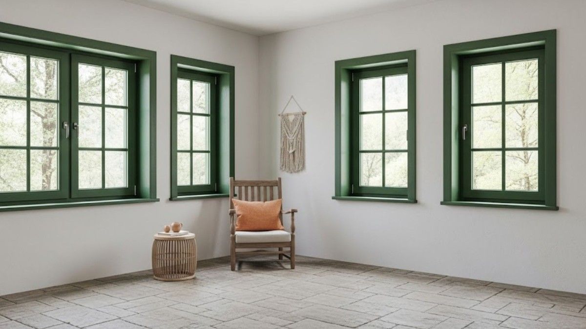
The colour green connects you to nature, which makes you think of trees, hills, or maybe a quiet courtyard. Forest green windows, when paired with clean off-white walls, feel fresh and add a nature-like charm to your room.
Once you sort your window colours, for flooring, you could try our stone tiles like Travenstone or wood-look finishes. These tiles bring in that slightly rugged texture without making the space look dated. These tiles look amazing when paired in contrasting colours on balconies and exterior walls, especially when surrounded by greenery.
3. Black Frames + Cream Walls with Polished Porcelain Tiles
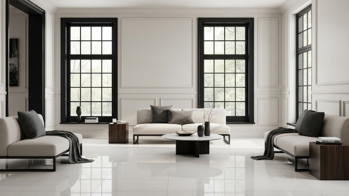
In modern homes, black window frames are very popular, as they cut through soft tones and add that sharp edge. With cream walls, the contrast becomes clearer, polished, and bold.
To tone down the boldness, polished porcelain cream tiles or very soft grey go well on the floor. Our Semint Ivory or Armania Cream range at Simpolo Tiles and Bathware does this well. It reflects enough light to keep the space feeling bright, but still lets the black frames remain the main feature. Black tiles complement the contrast and maintain the sharp edge.
Related Post: Modern Colour Combinations for Living Room Design Transformations
4. Slate Blue Windows + Light Grey Walls with Moroccan Pattern Tiles
Slate blue is basically a colour that sits between navy and grey in the colour wheel. When placed next to a pale grey wall, it adds a hint of colour without overwhelming the space. It’s a nice touch for anyone who wants a fade or light tone, but nothing too bold.
Tiles with Moroccan-inspired patterns work great with this, especially near windows or balcony walls. Our Moroccan-patterned collection is complete with options in soft blues and clay tones, and grey tiles that echo the same mood. It creates a slightly creative, slightly relaxed space that feels personal.
5. Terracotta Frames + Olive Green Walls with Brick-Look Tiles
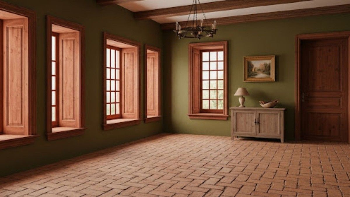
This combination might remind you of Mediterranean courtyards and sun-drenched walls where you see earthy patterns on walls and windows. Terracotta tiles paired with olive green add a warm, rustic, and grounded but premium feel.
To make the most of this design, use brick-look tiles or rough cladding tiles to carry this texture across the façade. We at Simpolo Tiles and Bathware have introduced the Terra Red Brick Texture series in similar setups. These tiles hold up well against weather changes and don’t lose their charm over time.
Related Post: How to Choose the Best Wall and Floor Tile Colour Combinations
6. Deep Burgundy Windows + Cream Walls with White Marble Tiles
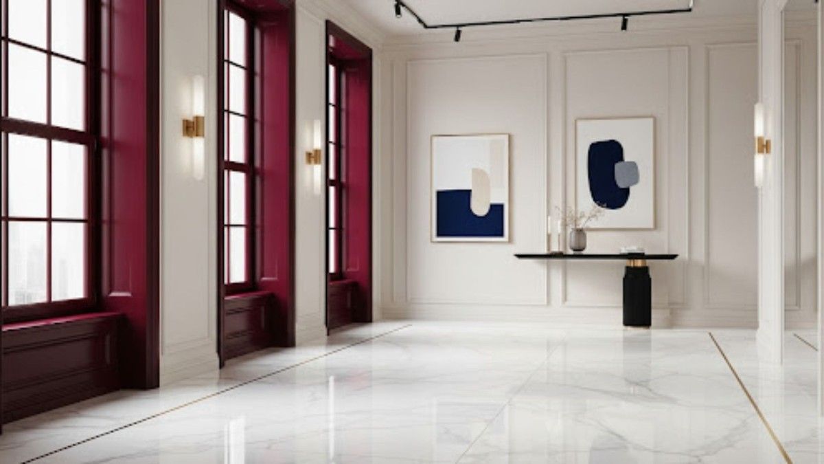
On cream walls, burgundy windows pop with colours and vibrance. However, to avoid making it too heavy, you can add glossy glossy white marble tiles. Our Rosseta Dove collection balances this look beautifully. The shine adds some luxury, and the simple white tiles keeps the rest of the space calm. It’s a strong look, often used in hallways, staircases, or entrances where you want to make a lasting impression.
Related Post: 7 Best Bedroom Wall Colour Combinations for a Cozy, Stylish Room
7. Golden Ochre Windows + Midnight Blue Walls with Grey Matte Tiles
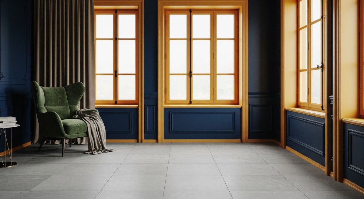
The combination of gold and blue is one of those rare pairings that works better than you can imagine. Midnight blue walls are rich and deep, and once paired with golden ochre window frames, the space feels lively and royal. To hold this all together, grey matte tiles are the safest option. Large-format ones from our Pietra Ash or River Grey series add structure while offering a clean surface below.
8. Soft Pink Windows + Sandy Beige Walls with Pastel Mosaic Tiles
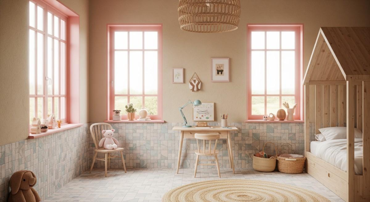
If your space is used as a children’s bedroom, quiet corner, or hobby room, soft pink frames are a playful choice. They sit well against sandy beige walls, creating a look that’s light, soft, and sweet.
Mosaic Azure Tiles in pastel tones add interest and visual contrast when paired with a pink window design. A selection like our Ritual Hazel tiles from the Alchimia collection provides special colours that are perfect for feature walls, small nooks, or kitchen backsplashes near the windows.
9. Muted Lavender Windows + Pale Grey Walls with Light Wood Tiles
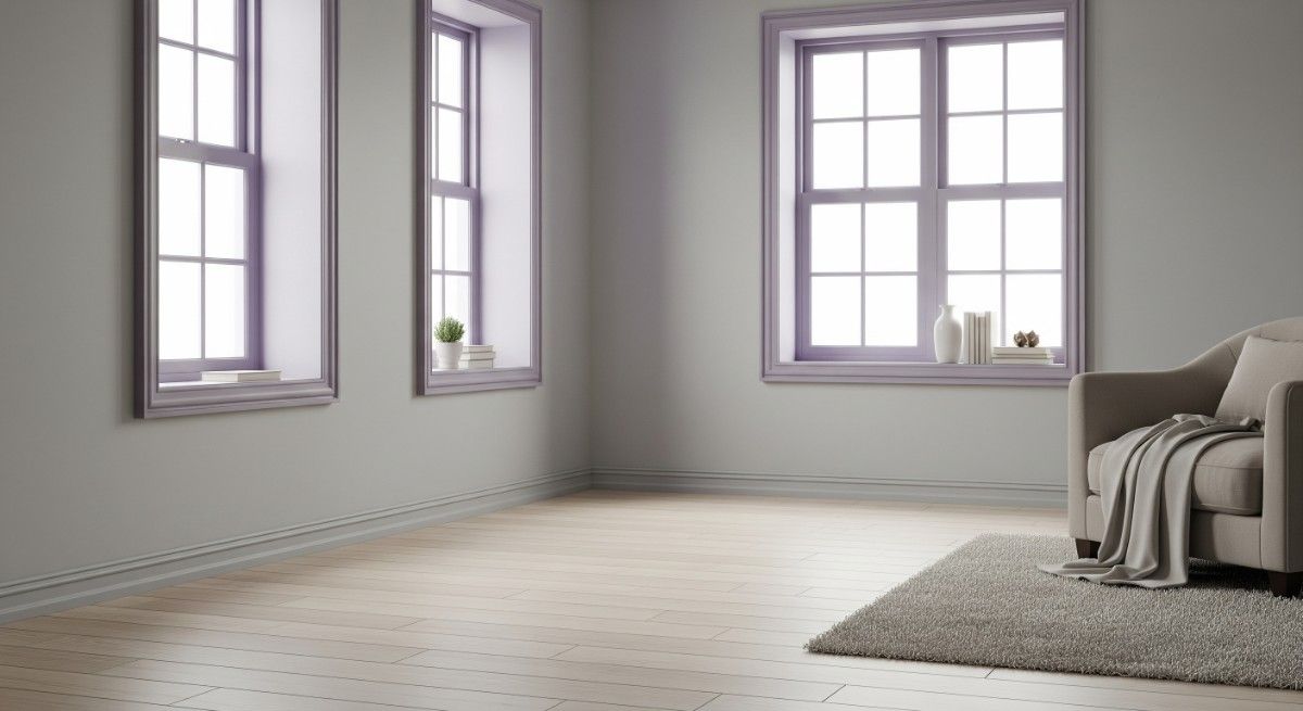
Muted lavender is soft, calm, and works well in private spaces. On pale grey walls, it feels balanced, making this choice of colour ideal for bedrooms or home libraries. For flooring, we suggest light wood tiles to give you a soft grain look that flows well with this colour palette. Try this look in our Virtual Space Creator in 3D before you finalise to get a better sense of how these colours behave in different lighting.
10. Steel Grey Windows + Bright White Walls with Graphite Tiles
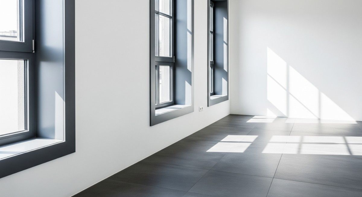
As a colour, steel grey is cool, modern, and direct. On bright white walls, it creates a sharp look that suits modern apartments or duplexes with straight architectural lines. To complete the look, use graphite tiles or ones with a cement finish. These materials are strong, low-maintenance, and perfect for high-traffic areas like main entrances or living rooms.
Related Post: 10 Wall Colour Combination to Transform Your Living Room
How to Choose the Right Colour Combinations Based on Your Tiles?
- Match undertones between tiles and window colours: Whether warm beige tiles or cool grey ones, aligning undertones helps create a seamless flow.
- Use contrasting finishes for drama: Pair matte window frames with glossy wall tiles or vice versa to create visual interest.
- Keep cohesive colour palettes in open layouts: In open spaces, ensure the door and window colour combination complements the tile palette for a unified look.
- Consider tile patterns before choosing bold window colours: Busy tile designs pair best with subtle window colours to avoid visual clutter.
Pro Tips to Match Window Colours with Tiles
To match your tiles with your door and window colour combination, you can:
- Test samples near tiled surfaces: Always check colour swatches against actual tile installations to see how they interact.
- Factor in natural light reflection on both tiles and window frames: Light changes how colours appear—evaluate during different times of day.
- Prioritise durability and finish: Choose weather-resistant finishes for exterior window frames, especially when paired with cladding or façade tiles.
FAQs about Window Colour Combinations
1. What’s the best window colour to pair with a yellow wall?
Try muted tones like charcoal grey or soft white. These balance the vibrancy of yellow while maintaining a modern look.
2. How do I test window colours before painting?
Always test colour swatches near your tiled walls and floors in natural light across different times of day. For visual clarity, use our 3D preview tools.
3. Should door and window frames always match?
Not necessarily. Complementary tones work well, especially when coordinated with your tile palette and overall theme.
4. Which finishes are best for exterior window frames?
Opt for durable, weather-resistant finishes like matte powder-coating, especially when paired with façade tiles.
5. How to update window colours on a tight budget?
Try repainting existing frames in neutral or accent colours that match your flooring or wall tiles for a quick refresh.