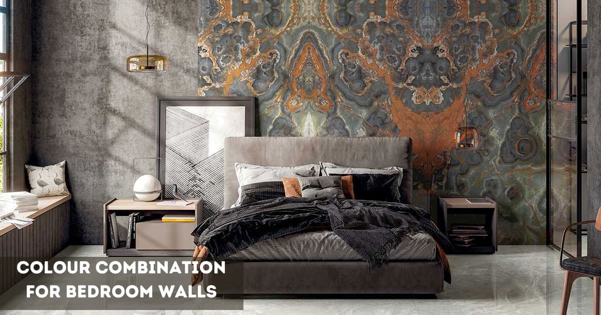
10+ Drawing Room Colour Combination Ideas for Walls & Floors
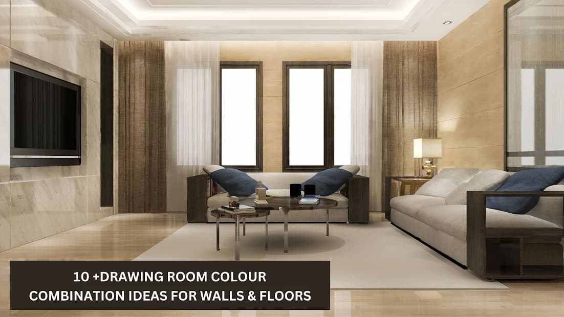
Choosing the right colours for your drawing room is not just about picking shades you like—it’s about creating a space that feels balanced, welcoming, and works perfectly with your floor tiles. Walls, décor, and tiles together set the room’s mood, and even small mismatches can make the space feel cramped or dull. The right combinations can enhance natural light, make the room appear larger, and highlight your furniture and décor. Here are 10+ drawing room colour combinations that pair beautifully with different types of floor tiles, helping you transform your living area into a stylish, comfortable, and timeless space.
10+ Drawing Room Colour Combinations That Perfectly Match Tiles
Here are 10+ thoughtfully curated ideas to inspire you:
1. Beige Colour Drawing Room with Wooden Finish Tiles
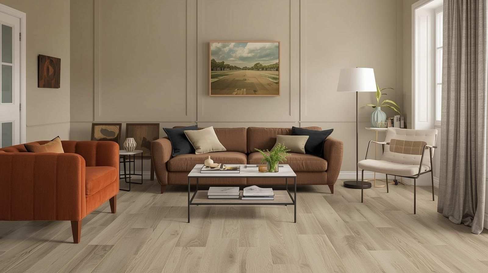
Soft beige walls create a warm and elegant atmosphere, providing a neutral yet inviting backdrop for deep brown or caramel furniture that adds richness and comfort. Using wooden finish tiles from Simpolo Tiles & Bathware in a matte finish enhances the natural feel by replicating authentic wood grain with durability and easy maintenance. This combination evokes a modern rustic ambience, blending organic textures and timeless tones that make the living space cosy and sophisticated.
2. Light Grey and White Marble Room Colour Combination
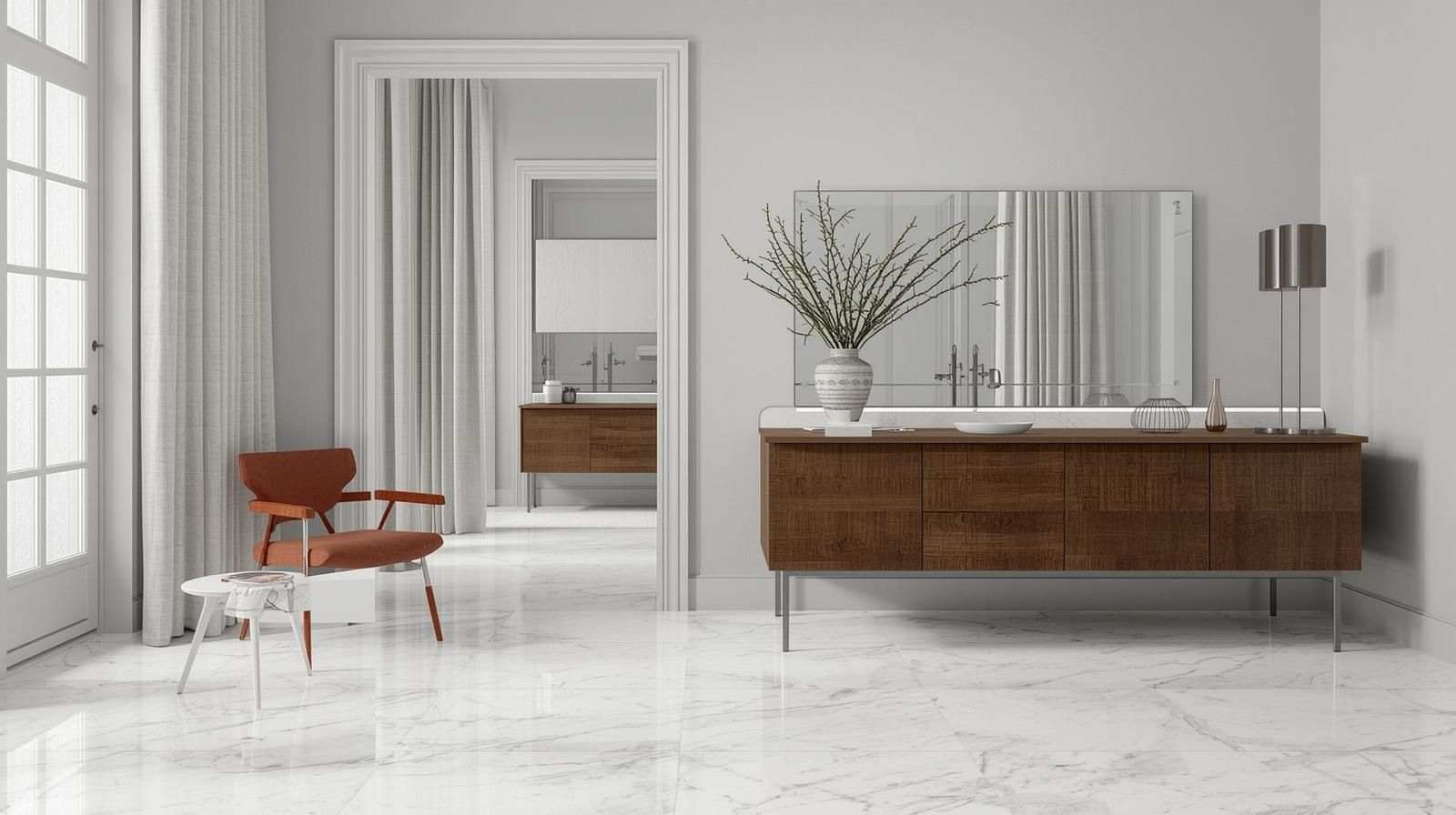
Light grey walls provide a subtle and soothing backdrop that promotes a sense of calm and openness, making them ideal for minimalist designs. Accenting this with white or silver décor highlights adds brightness and a refined touch. Glossy white marble-look tiles, such as Simpolo Tiles & Bathware’s Glacier Blanco or Calcutta Livid, emulate the luxurious veining and sheen of natural marble while providing the durability and low maintenance of porcelain. This creates a clean, airy, and elegant environment perfect for modern interiors.
3. Earthy Terracotta Drawing Room Colour Combination
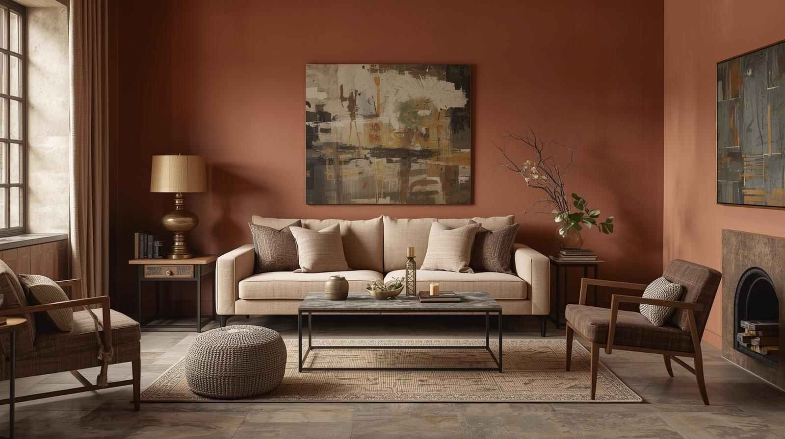
Earthy terracotta walls provide warmth and a grounded look with their rich reddish-orange tone, evoking natural clay elements. Bronze lamps and woven rugs reinforce the rustic, artisanal quality of the space. Complementing these are rustic tiles and patterned like Iron Slate or Markstone Slate, which feature natural stone textures and muted colours Pairing them with terracotta tiles creates a cohesive style that balances traditional charm with contemporary appeal.
Related Post :How to Combine Pooja Room Tiles with Drawing Room Tiles Seamlessly
4. Pastel Colour Scheme for Drawing Room with Ivory Tiles
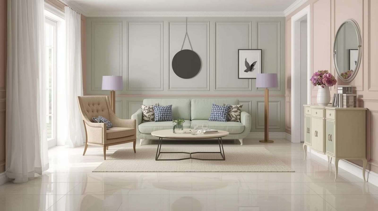
Soft pastel walls in hues such as blush pink, mint, or lavender offer a refreshing and gentle colour palette that brightens interiors without overpowering them. Paired with white curtains and light wood furniture, the space feels light and airy. Glossy ivory tiles from Simpolo Tiles & Bathware, like Fame White or Catta Snow, add a sleek, reflective surface that enhances natural light and contributes to a fresh, inviting atmosphere.
5. Navy Blue and Grey Colour Combination for Drawing Room
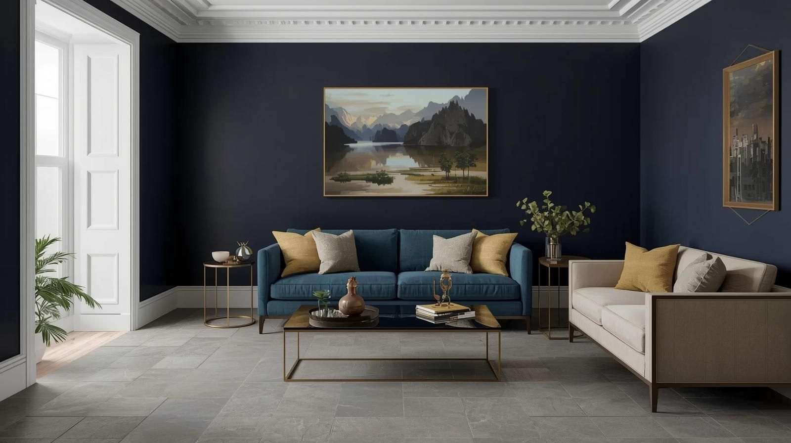
Deep navy blue walls create a dramatic and sophisticated backdrop that adds depth and intensity to any room. Accents in metallic finishes and gold cushions introduce warmth and shine, balancing the dark tones. Matte grey tiles, such as Fossil Dove or Cementi Verde, provide a muted, textured surface that complements navy without competing, resulting in a luxurious and bold aesthetic that works well in contemporary spaces.
6. Classic White and Black Drawing Room Colour Combination
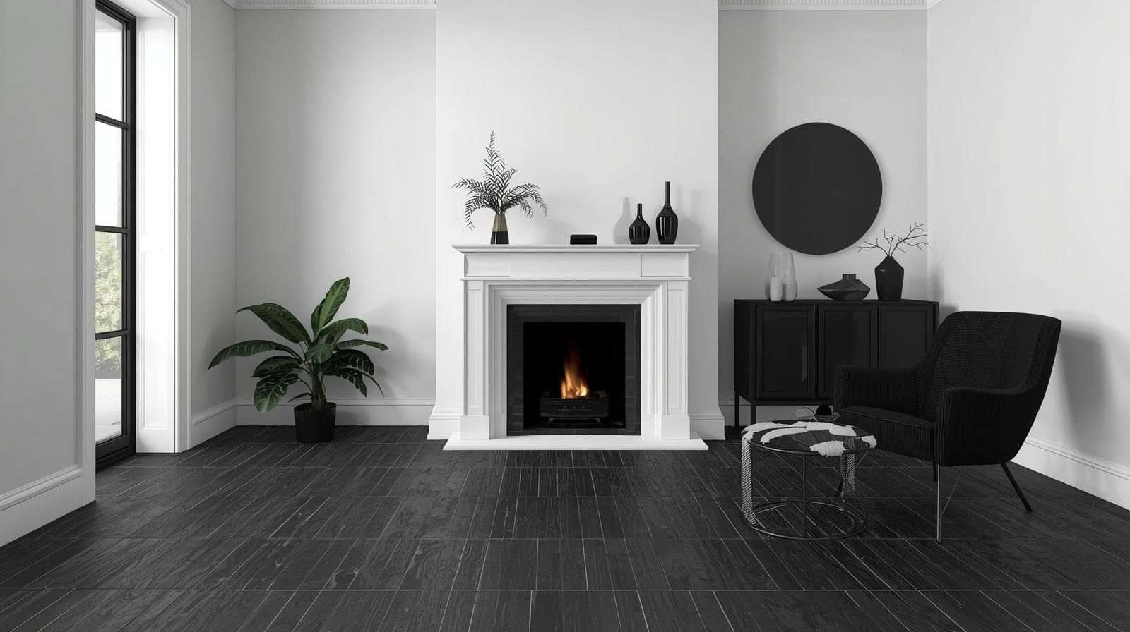
Crisp, white walls offer a bright, clean canvas that reflects light effectively, maintaining an open feel. Minimal black frames and sleek décor add subtle contrast and structure. Textured black tiles, such as Cardo Thunder or Marquina Night, add tactile interest while maintaining a striking monochrome palette. This pairing creates a sophisticated and dramatic look ideal for modern interiors with a bold, graphic edge.
7. Cream and Beige Colour Combination for Drawing Room
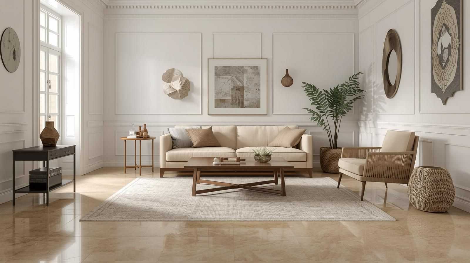
Cream or off-white walls provide a soft, warm backdrop that is versatile and welcoming. Accents like wooden tables and neutral rugs emphasise natural textures and tones. Polished porcelain beige tiles such as Crystone Sand or Marfig Taupe reflect light gently and add a smooth surface that enhances the warmth of the room. The effect is an inviting, adaptable space suitable for a wide range of décor styles.
Related Post :Top 10 Elevation Colour Combinations & Tiles Ideas
8. Sage Green and White Colour Scheme for Drawing Room
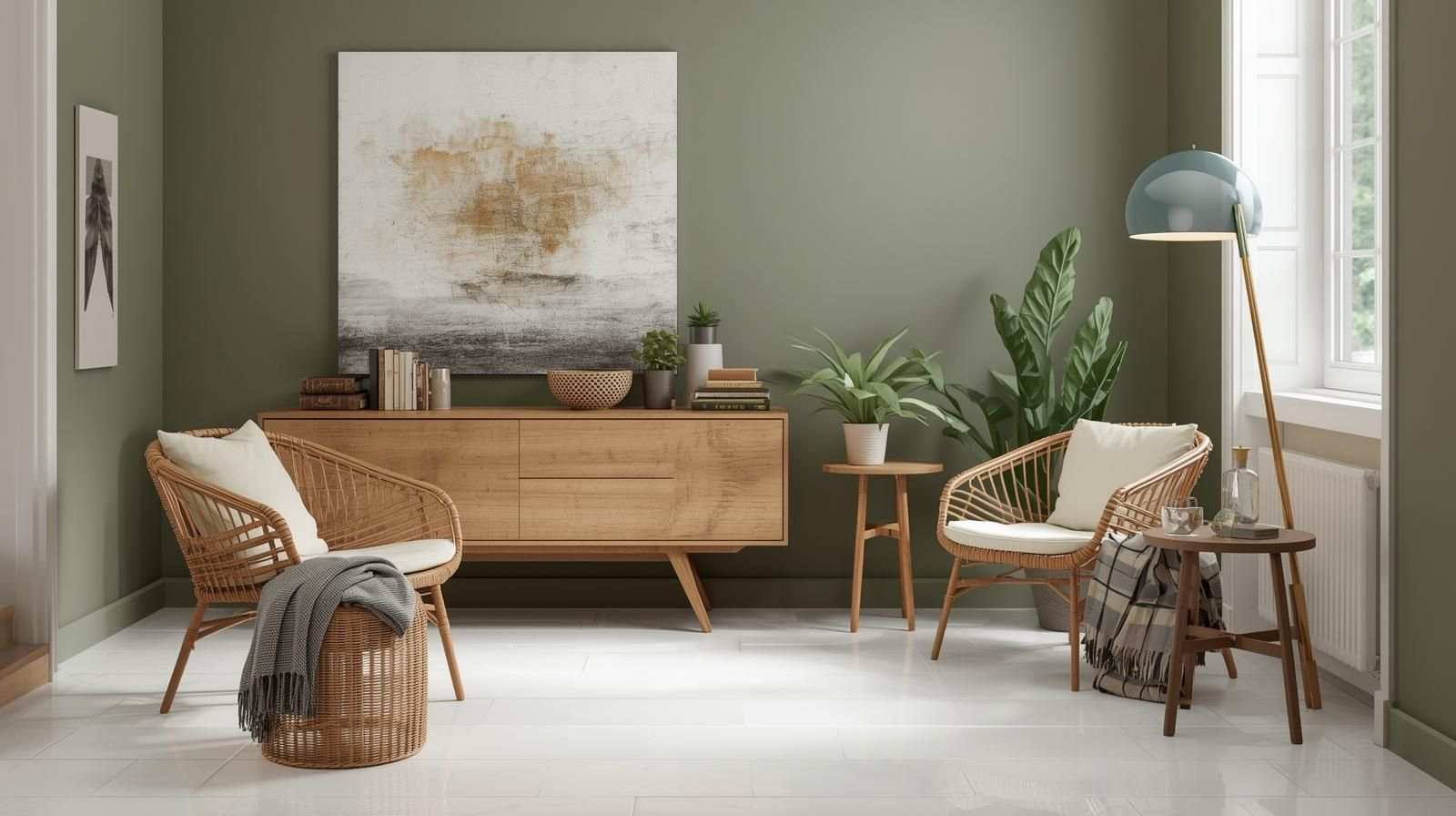
Muted sage green walls evoke a calming, natural ambience that works well in conjunction with indoor plants and wicker furniture, reinforcing a nature-inspired theme. Glossy white tiles, such as Spectra Salt or Simpolo Tiles & Bathware Glacier Blanco, bring a clean, luminous finish that contrasts softly with the green, enhancing light and creating a fresh, tranquil environment.
9. Mustard and Grey Drawing Room Colour Combination Indian Style
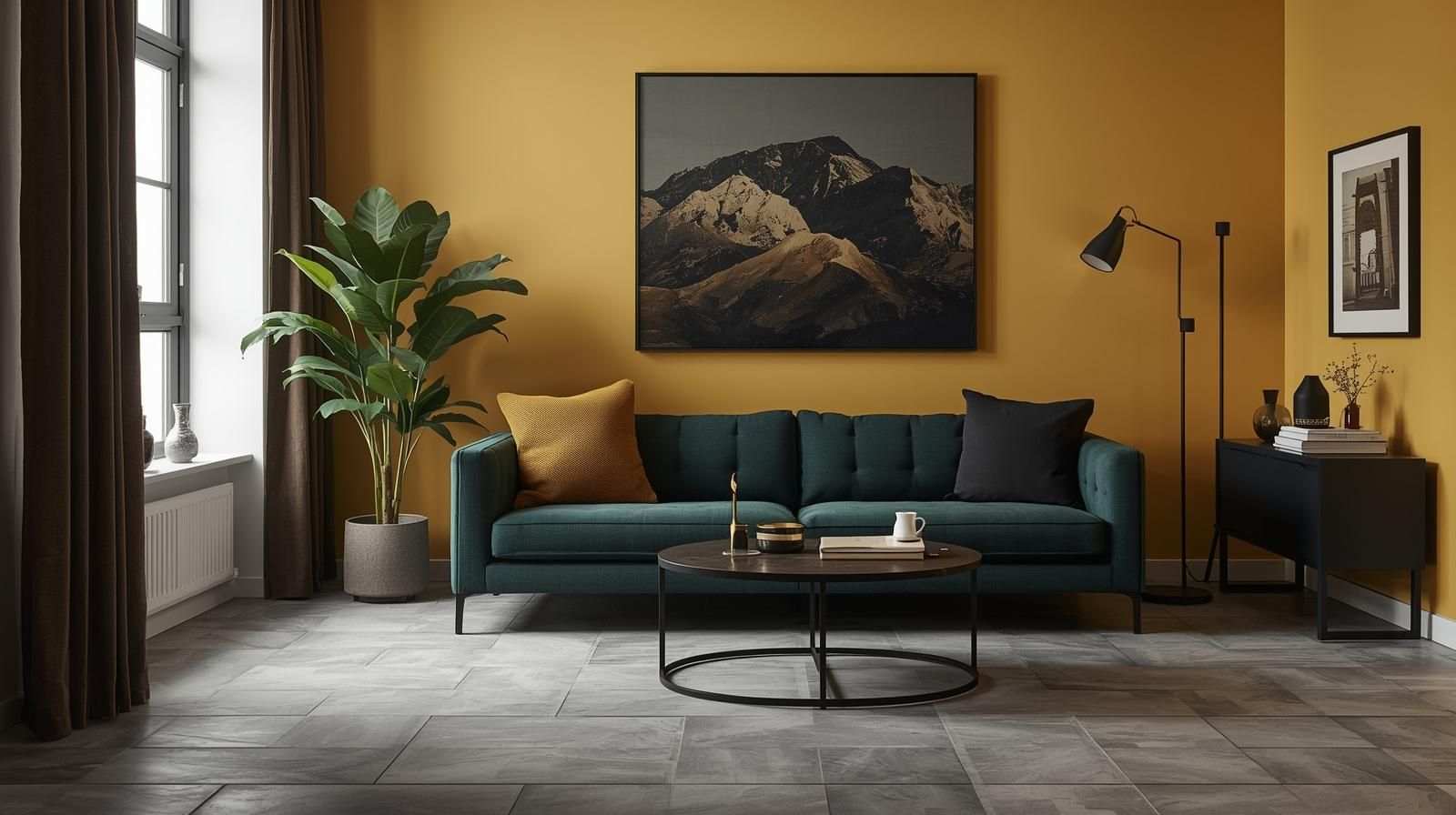
Mustard yellow walls introduce a cheerful and lively energy to a space while remaining grounded enough to avoid overwhelming it. Paired with black or deep green accessories, the room gains depth and a balanced palette. Neutral grey wall tiles such as Spectra Mushroom provide a subtle and versatile base that tempers the richness of mustard, resulting in a contemporary and vibrant interior.
10. Peach Walls with Marble-Look Tiles
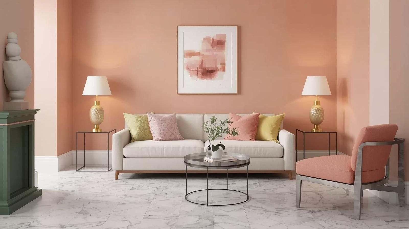
Peach or coral hues on walls provide warmth and a soft, inviting glow to any room. Accents like brass lamps and pastel cushions add layers of complementary colours and textures. Marble-finish porcelain tiles, such as Calcutta Prism, showcase elegant veining and a polished surface that mimics the luxury of natural marble while being easier to maintain, contributing to an overall style of modern elegance with a gentle, sophisticated touch.
11. Charcoal Grey and White Colour Scheme for Hall or Drawing Room
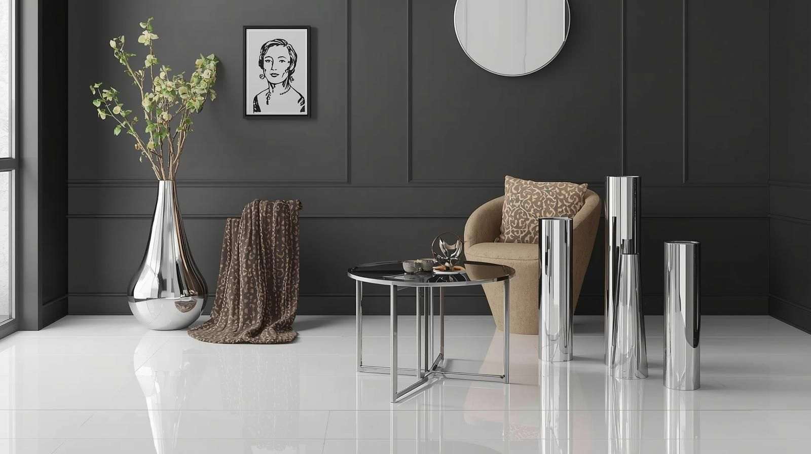
Dark charcoal grey walls offer a bold and dramatic contrast, adding depth and a modern industrial edge to interiors. Silver and glass décor pieces reflect light, adding shimmering highlights that brighten the space. High-gloss white tiles create a reflective surface that balances the dark walls, ensuring the room feels lively and stylish with a chic, contemporary flair.
12. Dual-Tone Drawing Room Colour Combination with Accent Tiles
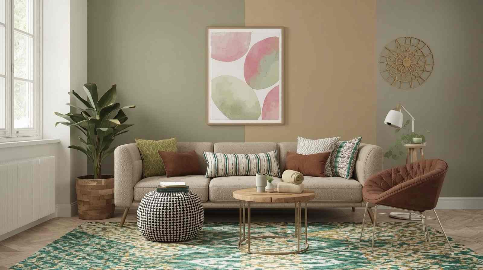
Combining two complementary wall colours, such as cream and olive, adds depth and visual interest, creating a dynamic yet harmonious backdrop. Mixed textures and complementary cushions, along with pattern tile, add depth to this layered look. Patterned decorative tiles, such as Spectra Herbs or Spectra Tango, serve as bold focal accents with artistic prints and vibrant colours, perfect for creating a statement wall that showcases an eclectic style and personality.
Related Post : 15 Modern Bedroom Colours Ideas With Stylish Bedroom Tiles
Popular Drawing Room Colour Combinations by Style and Mood
Explore combinations tailored to different styles and moods:
- Modern: Grey, white, and black with metallic accents for sleek sophistication.
- Traditional: Cream, maroon, and gold tones for warmth and richness.
- Contemporary: Neutral bases with bold accent colours for dynamic spaces.
- Relaxing: Soft blues, greens, and neutrals to create calm environments.
- Energetic: Yellows, oranges, and reds to energize and uplift.
- Elegant: Beige and gold accents for timeless luxury.
- Cozy: Warm browns and creams for inviting comfort.
Accent Wall Ideas for Drawing Rooms
Accent walls add depth and personality:
- Dark Accent Walls: Use navy, charcoal, or deep green for drama.
- Two-Tone Walls: Combine complementary colours for balance.
- Textured Finishes: Add tactile interest with textured or patterned tiles.
- Pattern Tiles: Use decorative tiles to create artistic focal points.
Types of Tiles for Drawing Room
Simpolo Tiles presents options tailored for Indian homes emphasizing durability and style:
- Vitrified Tiles: Low porosity, stain and scratch resistant. Finishes: glossy, matte, textured. Sizes: 60x120cm, 90x90cm
- Wood-Look Ceramic Tiles: Authentic timber appearance without maintenance issues. Ideal for classic to rustic interiors.
- Stone-Effect Tiles: Provide a natural, rugged texture; perfect for elegant & earthy designs.
- Decorative Pattern Tiles: Can be used for accent walls or floor motifs that creatively enhance space. Sizes: 20x20cm, 30x30cm
Why Colour Combinations for Drawing Room and Floor Tiles Matter
A carefully chosen drawing room colour combination ensures visual harmony and practical appeal rather than guaranteeing perfect cohesion. When wall shades complement floor tiles, the result can be an inviting space, but overly matching wall and floor colours may make a room feel monotonous rather than dynamic.
Benefits are as follows:
- Enhances overall aesthetics and décor balance without overpowering.
- It can create an illusion of more space or warmth, depending on contrast and tones.
- Neutral colour schemes may appeal broadly, but they do not guarantee an improvement in resale value.
- Tile durability depends on material and finish, not colour matching; selecting durable tiles ensures practical use in high-traffic areas.
Choosing the Right Tiles & Colour Scheme for Drawing Room
Your tile choice directly influences how your drawing room colour combination is perceived. Explore multiple finishes and textures that pair beautifully with wall shades:
- Ceramic Tiles: Affordable and versatile, easy to maintain. Best for light to moderate traffic areas. Works well with lighter pastels and cream walls.
- Vitrified Tiles: Durable, available in glossy, matte, and textured finishes. Ideal for bold or neutral walls, depending on the finish.
- Marble-Look Tiles: Suited for premium spaces, complementing white, peach, grey, or other shades depending on the veining and undertones.
- Wooden-Look Tiles: Offer warmth and rustic charm, while also complementing modern or eclectic interiors. Pair with beige, cream, terracotta, or contrasting tones.
Drawing Room Colour Combinations by Size & Natural Light
When finalising your drawing room colour combination, consider:
- Small Rooms: Lighter walls (cream, pastels) with glossy or light-reflective tiles can make the room appear larger. Matte or textured tiles may be more practical, as they can help avoid glare and show less smudging.
- Medium Rooms: Experiment with accent walls while keeping floor tiles neutral for balance.
- Large Rooms: Deep, bold colours like navy, charcoal, or mustard pair well with textured or patterned tiles. Ensure sufficient lighting to prevent the room from feeling cavernous.
- Lighting: Light colours enhance dimly lit rooms; darker tones work best with natural sunlight.
Related Post :Top 10 Trending Bathroom Tile Color Combinations
Drawing Room Colours & Vastu: What to Choose for Positive Energy
The colour combination you choose for your drawing room set the mood for the whole home. In Vastu, the right colour combination doesn’t just look good—it helps create calm, positivity, and an easy sense of balance.
With Simpolo Tiles, turning that feeling into a real space is simple. Think any colour combination for your drawing room be it light, earthy tones - cream, beige, sky blue, or soft brown shade. These shades will make the drawing room look calm and close to nature mood, make it welcoming, and keep the energy flowing gently.
Some vastu-tips for your drawing room colour combinations:
- East-facing rooms: Cream or light yellow tiles amplify brightness and freshness.
- North-facing rooms: Sky blue surfaces bring calm and clarity.
- West-facing rooms: Pastel green tones create grounding balance.
In the end, the best colour combinations for your drawing room are the ones you can live with every day - warm, balanced, and quietly uplifting, so the drawing room feels good and welcoming as you walk in.
Also Read: Colour for Living Room as per Vastu: Harmonise Energy & Style
Maintenance Tips for Drawing Rooms with Tile and Colour Pairings
- Use neutral cleaners suitable for tile finishes to preserve texture and finish.
- Avoid abrasive tools to maintain tile surface integrity.
- Periodically clean grout lines to avoid discoloration affecting the overall look.
- Use rugs or mats in high traffic zones to protect tiles.
- Match wall paint finish with tile type to reduce cleaning frequency, e.g., washable paint near textured tiles.
Why Choose Simpolo Tiles for Your Drawing Room?
- Advanced Manufacturing: Cutting-edge tech ensures superior strength and lasting colours.
- Multiple Finishes: Matte, glossy, and textured finishes to meet varied design needs.
- Climate Adapted: Tiles withstand India’s heat, moisture, and heavy use.
- Easy Upkeep: Tiles are stain and scratch resistant, simplifying cleaning.
- Warranty & Support: Industry-leading warranties with nationwide dealer network and after-sales service.
- Customer Experience: Rated highly by Indian homeowners for durability and aesthetics.
Conclusion
Choosing the right drawing room colour combination is about achieving balance and visual appeal rather than strict matching between walls, décor, and tiles. With careful planning, you can highlight your personal style while ensuring the space feels cohesive and harmonious. Whether you prefer soft neutrals for a calming atmosphere or bold contrasts to make a statement, thoughtful colour and tile choices can transform your drawing room into a welcoming and stylish area. By considering lighting, furniture, accessories, and tile finishes, you can create a space that is visually appealing, functional, and timeless.